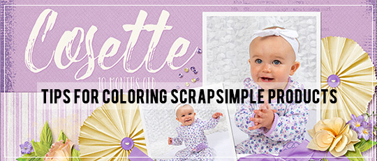
Does the thought of using ScrapSimple products terrify you? If so, you’re not alone! I’m here to demystify the whole ScrapSimple world by pointing you to some super-helpful resources, plus I’ve written this tutorial to show you how to turn out some incredibly pretty paper and embellishments in no time at all!
First, it helps to understand what they are: ScrapSimple Templates come in grayscale and can be colored to work with your specific scrapbook projects. This makes them one of the most versatile digital scrapbook products available, but it can also make them an intimidating product to use, especially if you’re just getting started in digital scrapbooking! But there is good news: You can find the basic methods for coloring templates in the free ScrapSimple Handbook. And before you head over for that free handbook, take just a minute to read through this tutorial and I’ll show you a few ways you can fine-tune embellishment colors and get the look you want for your page.
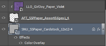
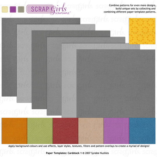
Let’s start with the background paper. I colored a paper from ScrapSimple Paper Templates: Cardstock by creating a Color Overlay style. If you haven’t colored templates with layer styles, check out this quick tutorial here.
Note: If you don’t use Photoshop, you can use a Color Overlay adjustment layer instead.
Next, I placed a border from ScrapSimple Paper Templates: Assorted Edges 1 over the paper to define the edge and make the paper more interesting. I colored the border by clipping a purple paper to the template. You can vary the look by adjusting the Blending mode of the paper and/or the opacity of the template layer. You can see how the paper layers stack up for my layout in the screenshot below.
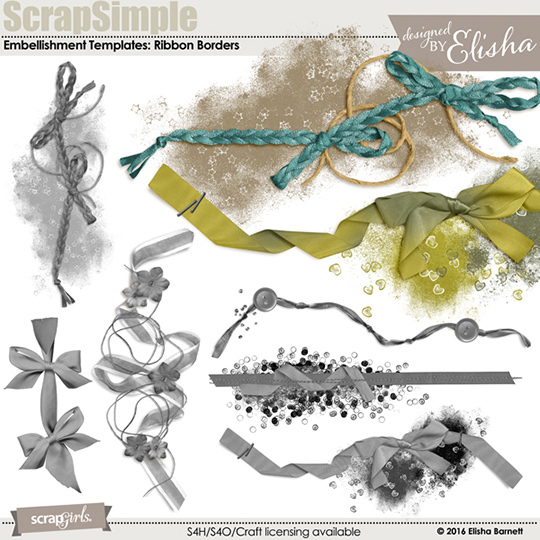
Next, I used Hue/Saturation Adjustment Layers to color a ribbon and bow from ScrapSimple Embellishment Templates: Ribbon Borders. If there is a specific color you would like, make sure to select the color you’d like for your embellishment and set it as your foreground color first.
To create the adjustment layer, click on the Adjustment Layer icon at the bottom of the Layers panel and choose Hue/Saturation from the menu.
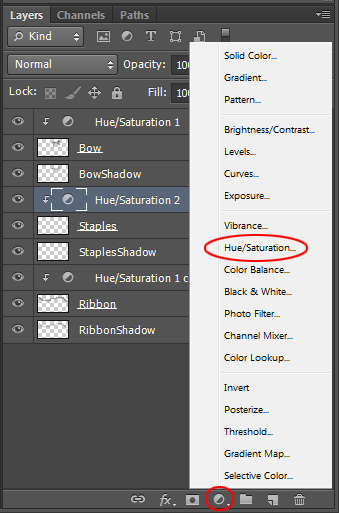
After the Hue/Saturation panel opens, click on the Layer Mask icon at the bottom of the panel to turn on the layer mask. Now, check the Colorize box and the embellishment will turn the hue of your foreground color. You will usually need to adjust the Saturation and Lightness sliders to get an exact match. This template has the bow and ribbon on different layers. If you want them to be the same color, just copy the adjustment layer of the bow embellishment, move it directly above the ribbon embellishment, and then add a clipping mask.

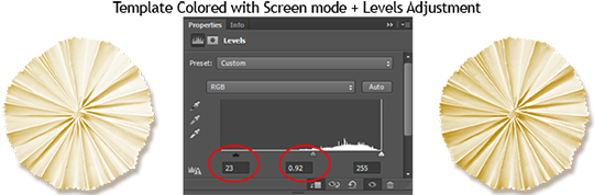
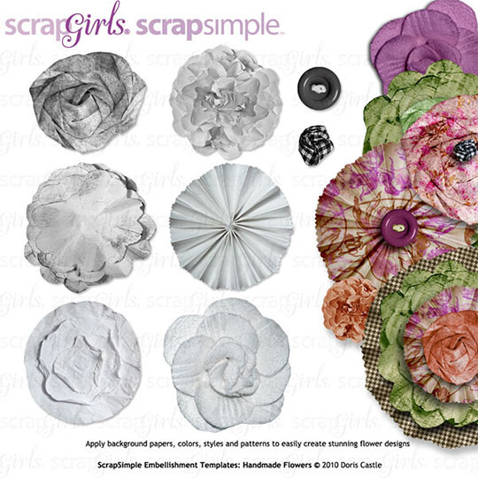
Next, we’ll color a paper rosette from ScrapSimple Embellishment Templates: Handmade Flowers. I colored mine a soft yellow, and when the gray of the template blends with the yellow, the center shadows are very dark, and the edges look a bit muddy. This is a common problem when coloring templates yellow.
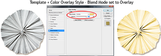
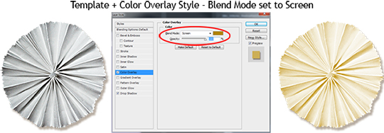
To fix this, you can simply use a different Blending mode. I usually scroll through the Blending modes to see which ones show the details of the template and are closest to the color I am aiming for. For the rosette, I changed the Blend mode to Screen and then changed the color for the overlay to a much darker yellow.
While I fixed the dark shadows, the rosette is now a little lighter than I’d like. To fix this, I added a levels adjustment layer (Layer > New Adjustment Layer > Levels) to correct it. The original output numbers on the levels adjustment were 0, 1.00, and 255. I moved the left and middle sliders to the right until I liked how the shading looked. When you want to get brighter or more subdued colors, darker or lighter shadows, or need more or less color saturation, a levels adjustment layer will usually help with those issues, too.
We’ve covered a few different ways to fine-tune the color of your ScrapSimple templates. Every template is different so it helps to try several different coloring methods on a template to see which is best for your layout.
If you’re like me, you have a stash of ScrapSimple papers and embellishments just waiting to be used on your pages. Go ahead and try one or all of these techniques on one of your next pages. Plus, check out the resources in the links I referred to above. Give these techniques a try, then show off your work in the Scrap Girls Gallery!
![]()
 (Click on image to be taken to product page)
![]()
![]()
![]()

![]()
![]()
 Tutorial written by April Martell