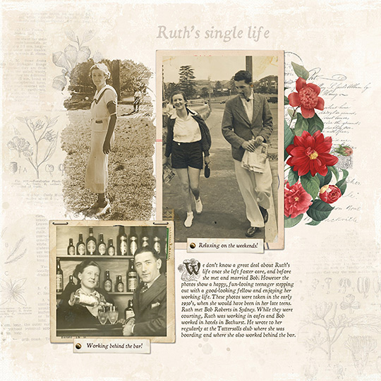
A block of journaling looks so much more interesting (and professional) with a dropped capital letter as the first character in the first word. Magazines often use this technique to draw your attention to the paragraph. I use it all the time on my heritage pages. Let me show you how to do a drop cap in just a few steps!
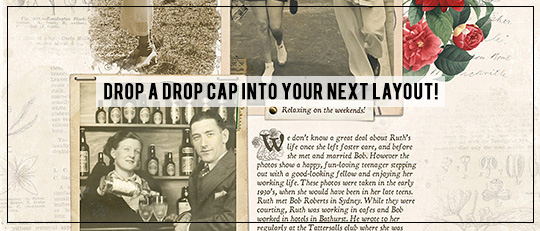
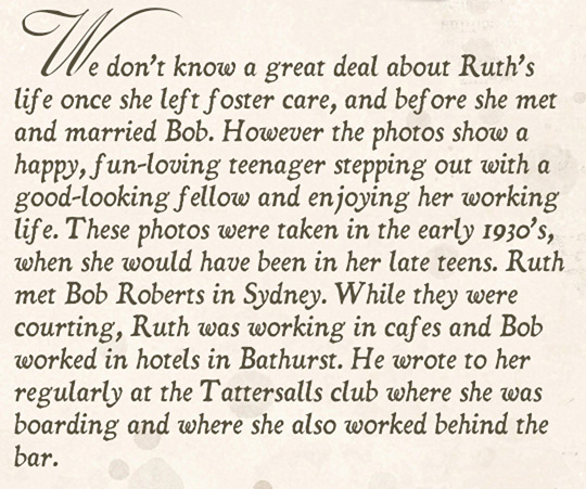
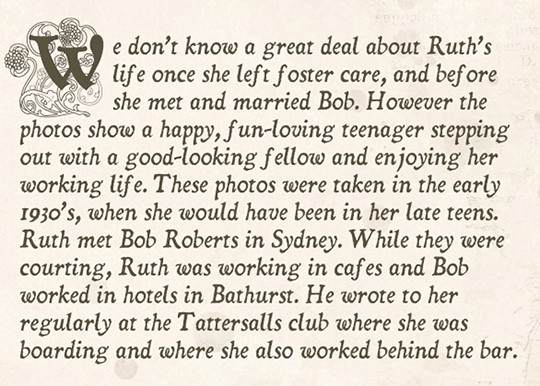
Here’s the first effect we’re going to create:
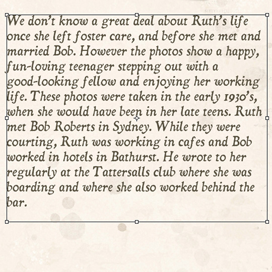
1. Select the Horizontal Type tool, and in the Tool Options, choose the font and the point size you want your main block of text to be. I’m using Dominican Italic with a point size of 12.
2. Click and drag out a text box on your page and type out your text.
1. Click and drag over the first letter to select it.

2. In the Tool Options, select the new font. I’ve chosen Celeste. In the Tool Options, also highlight the point size and press the Up Arrow Key until you are happy with the look of the letter.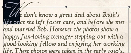
3. In Tool Options, click the checkmark to accept the change.
You can experiment with different fonts for your first letter. This font is Beautiful Caps ES.
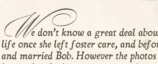
If using a different font makes the text look a little crowded, you might need to create a little more space between the first letter and the rest of the word.
4. After typing your first letter, press the space bar once or twice to move the rest of the text along a bit, which is what I had to do with Beautiful Caps ES.
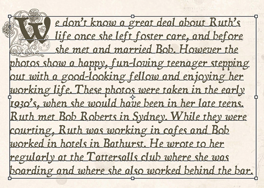
Another way of creating a drop cap look is to create a boxed area and type your main text around it.
You can’t create this look with a text box so you’ll need to type your decorative capital letter first. Then on a new layer you’ll type the rest of the text. Here’s how:
1. After typing the decorative first letter, click the checkmark to accept the type.
2. Press the Shift key (so the Type tool will know you’re typing new text on a different layer), then type the rest of your sentences in the main font.
3. When you’re ready to begin a new line, press the Enter key (Mac: Return key), and then press the space bar several times until you clear the capital letter. You’ll need to do this for three or four lines, depending on how much space you need to keep clear for your large letter.
The font I used for the first decorative letter in this arrangement is Floral Caps Nouveau in upper case.
4. The last step is to click the checkmark to accept the type.
Although this method of “boxing” a capital letter is more tedious, it is worth the effort.
I hope you enjoy playing around with these drop cap techniques! Give these steps a try on your next layout, then be sure to post your results in the Scrap Girls Gallery so we can oooh-and-ahhh over your creativity!

(Click on the images below to be takend to product page)
ADDITIONAL PRODUCTS USED:
- Cardstock – Winter Washed Paper
- Journal Mats Embellishment Mini
- Story Book Easter Embellishment Mini (used as a photo mask)
- Shabby Tags Embellishment Mini
- Botanical Overlays Vol 1 Embellishment Mini
![]()

Tutorial written by Susie Roberts