

It’s here! Our newest digital kit Simpler Times, which benefits our Charity of choice – Food for the Poor! A few weeks ago we asked your help in picking out the theme, color palette and name.
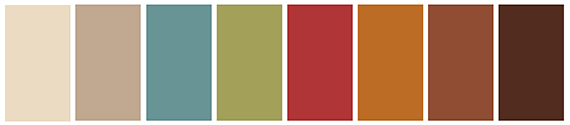
The designers took your winning picks and came up with this beautiful kit! This is the perfect digital kit for heritage themed layouts and projects but can be used for just about any themed project.
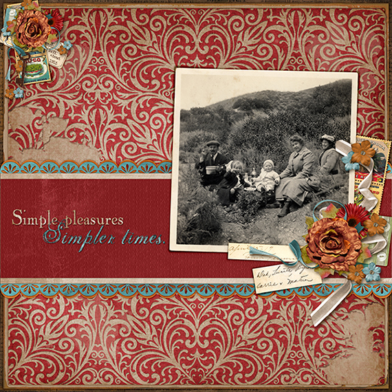
Digital scrapbooking layout by April Martell
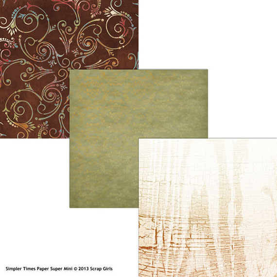
Not only will you receive this beautiful kit but a BONUS paper mini as well!
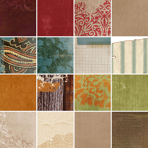
Here are some close-ups of the kit contents and as a special treat, the designers share what inspired their creations:
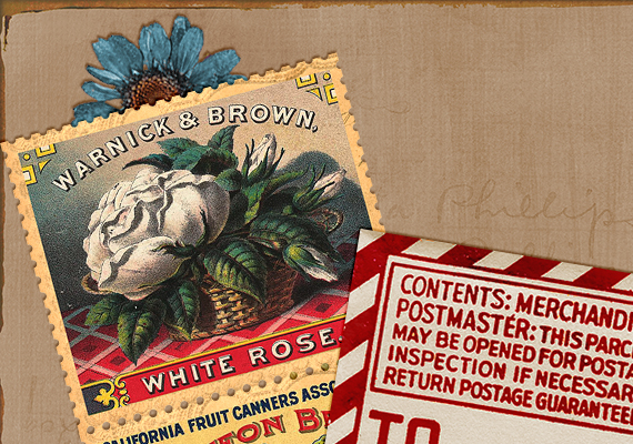
The stamps were inspired by the lovely creative board you ladies put together. I knew I had some vintage labels handing around my EHD and I loved the blue of the label on the idea board. The paper color was inspired by Jo’s lovely paper and was made to be a companion. I love patterns, but sometimes you need a good textured solid to make it balance. –Brandy Murry
My inspiration came from the original inspiration photo – the red ornate thingy (not sure exactly what it is). When I thought of vintage types of things, I also thought of photo corners holding vintage photos in a photo album, so I combined the two and came up with some fancy photo corners. – Cherise Oleson
When I created my papers, I was thinking of barn doors and family trees. For my barn door paper, I recolored a photo of an old board and then added some interest with some brushwork along the edges. For the family tree paper, I blended the silhouette of a tree into the background of a solid paper. Family trees make me think of my grandparents and led me to the grid paper, which my grandfather always has in his desk and his workshop to use when he is planning a project. So, I created a bit of a decorative edge to my tree paper with layered grid paper and some tape. – Jennifer Ziegler
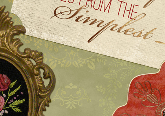
The cameo is inspired by my grandmother. When I saw the blue and creme colors in the palette I immediately thought of her. She would have Sunday dinner at our house each week. And it never failed that she wore her brooch each and every time. My most vivid memory of her is when she and I would sit in the rocking chairs on the back porch after dinner. Occasionally she would actually let me hold the brooch and study it. – Ginny Whitcomb
My twine-wrapped word art was created using one of my favorite go-to techniques: duplicating the twine layer with the word art layer in between, then erasing the top twine layer where I want it to appear to be going “underneath” the word art layer. – Elisha Barnett
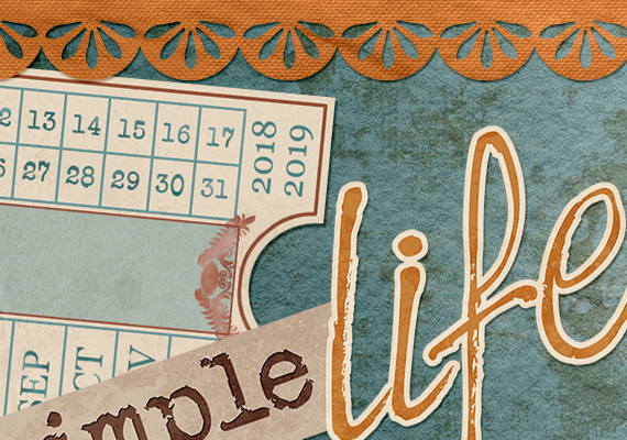
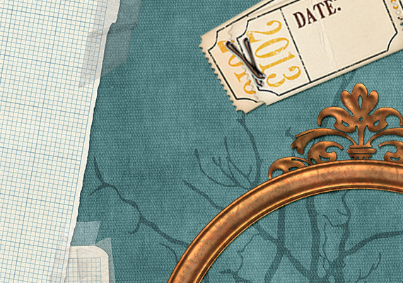
I was inspired by a trip to a very unique museum in Florida called Heritage Village, which is home to some of Pinellas County’s most historic buildings. One building in particular caught my attention, the old train depot. It has stacks of old suitcases, wood crates, and a bunch of historic train tickets. I reproduced one of the tickets, and designed one that could be used for recording dates. – Marlene Peacock
The twig is from our passionfruit vine. Growing food reminds me of my Great Grandma’s vegetalle and fruit garden, the first place we would go when visiting their home. The Simple Life word art reminds me of this period of time in which life seemed to be of a slower pace, a simpler time. – Jacqui Smith

As for what inspired me, I wish I had a great story behind it: ( I just wanted to create something to put dates on, rather than just typing up dates on the layout- thus the “date” ticket. As for the word art, I’ve always loved repeating words in different fonts as well as dictionary definitions. – Armi Custodio
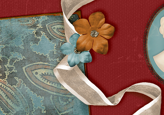
I was inspired by vintage luggage, old wood textures and vintage silk flowers. I have always been drawn to color swatches and thought I would take it up a notch by adding pretty vintage patterns to each swatch. I love the color palette our customers and Facebook friends helped pick out and it made it easy to create elements using those gorgeous colors! -Syndee Rogers-Nuckles
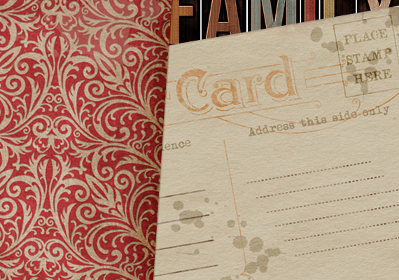
The postcards I thought would be good for layering. They are actually old postcards from my own relatives that I had in my genealogy archives. What could be a more “simple time” than when you could mail a postcard for a penny! -Angela Blanchard
What inspired me was memories of my grandparents’ attic. They had some great mementos from days gone by – things like granny boots, dolls and a phone table (remember those?). They had a photo of a family member posing with a penny farthing and that stuck in my mind. That bicycle perfectly symbolized my ideas of beauty and of “simpler times”. – Laura Louie
The inspiration board brought to mind field notebooks filled with botanical drawings, butterflies, etc. Added an extra tag. Love what everyone has done and I think the customers will as well. – Kim Meeder
The tin buttons were inspired by the tin flower holders in the inspiration. The bike is also from the inspiration, and from Target who had a floral bike for sale last year. – Sarah Batdorf
Old newsprint clippings remind me of simpler times and a way that memories were kept. Don’t we all have baby books with our birth announcement clipped from the newspaper? Not quite the same as the fancy birth announcements that are mailed out today, but so much simpler. And I just love the word reminisce. It is an interesting word and I also love to do it. Sitting around “reminiscing” about the good old days is a great way to spend an evening! – Brandy Hackman
The inspiration for mine – My husband’s grandmother loved to paint flowers on pieces of china. The family has numerous teacups, saucers, teapots and decorative plates Addie made. I wish I could have known her but she passed away before I met Jeff. I would have loved a painting lesson or two! – Cheri Thieleke
I spied a vintage hat on a coat rack of an older woman’s house that I visit often — she had lots of different ones, but I really liked the shape of this one that I chose. I took a photo of it, then using it as inspiration, drew it out in Photoshop using the pen tool, including the bow. Then added lots of texture to the hat to make it look more like fabric. For the suitcase, I drew inspiration from the original photo, but knew I wanted to do a side view of it. Using more custom shapes, I drew the suitcase and again, added various colors and textures to it to give it interest. I wanted lots of travel-related stickers on the suitcase, but also wanted them to stay neutral enough that you could imagine your own destinations on them, so I added blank stickers in different shapes that can be customized if you want or left as they are. These contributions are just my style — cute, textured, hand-drawn embellishments that are lots of fun. – Laurel Lakey
The best part of purchasing this kit is that 100% of the proceeds goes directly to Food for the Poor, where the money is used to dig wells in some of the poorest regions in the world. This is the ninth year that Scrap Girls will create kits for Food for the Poor. To date, our combined efforts and our generous customers have supported the digging of over 13 wells in countries all over the Caribbean and Latin America, most recently in earthquake-damaged Haiti.
Thank you all for your support!


This is absolutely gorgeous! Thank you ladies for sharing all of your inspirations.