 May’s Club was created for you by Angie Briggs.
This month’s Scrap Girls Club is full of Chic goodness! We asked Angie what inspired her as she was working on this club; and the types of projects it would work well for. Here’s what she had to say:
I was inspired by a thread I started on the forum titled “what should I design” As I was reading through the answers several things struck my interest: chevron, pink, and zebra print. From there when I started designing I went with the soft shabby, chic feel since it was a Spring time club. But I also really wanted it to appeal to scrappers that had heritage type of layouts to do. So I made sure it was neutral enough to work for almost anyone and put in a more heritage selection of word art.
Layout inspiration from the Creative Team
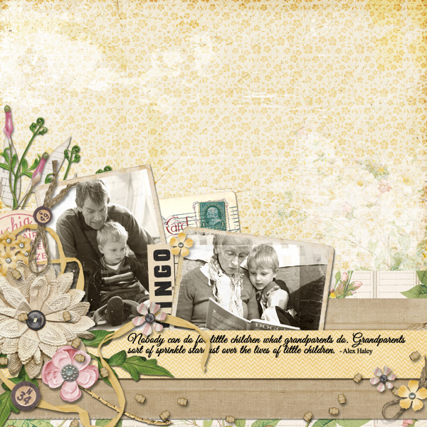
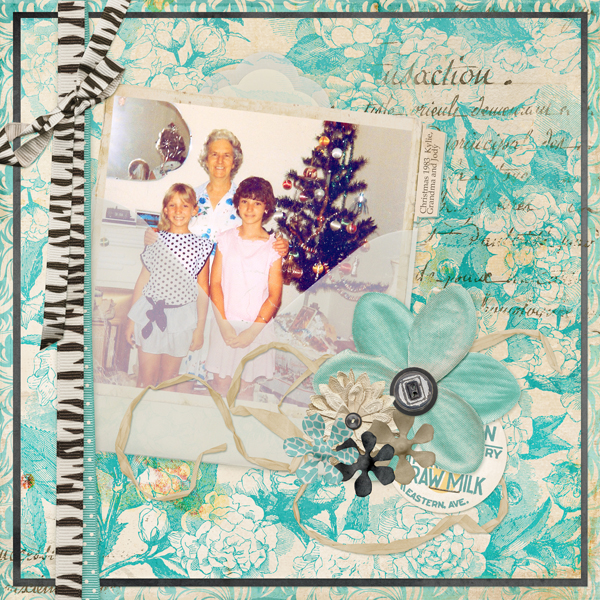
 Layout by Andrea-Rose Hutton
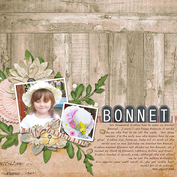
If you were to buy all of the items in the club individually from the Boutique they would cost nearly $27.00. In addition, the value of the Members-Only supplies that will never be for sale in our Boutique is $12 each month. This means that with a monthly subscription to our Club you will receive over $40.00 in supplies for just $9.99 a month!
We offer 3 subscriptions options to save you money!
Monthly Subscription ($9.99/month)
6 Month Subscription ($8.99/month)
12 Month Subscription ($8.49/month)
Not only do Scrap Girls Club Members save money but they also get exclusive Members-Only content every single month!


Article written using Adobe Photoshop Elements 12 with Windows 7
Patterns can be tricky. Used incorrectly, they can take over a whole layout and turn it into an unsightly mess. Used correctly, however, they can add a lot of oomph to a page and turn it into a striking eye-catcher!
Here are my tips for working with patterned papers:
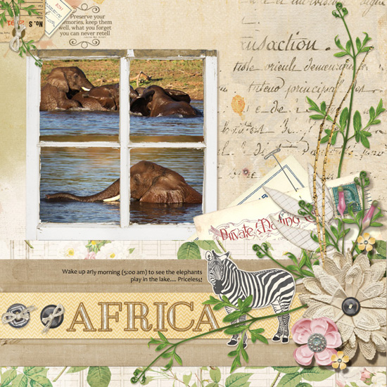
1- Select your photo, edit it, and position it.
Place your photo in its best possible position on your page. Use the Rule of Thirds to help make it the main focus on your page.
2- Select a range of patterned papers that you feel work well together.
If you are going to be using more than one patterned paper on your layout, be sure to choose similar tones and try for at least two neutrals. In my layout, I tried a range of papers, turning off the Eye icon until I decided which would be my main background paper. Once I had this selected, I used the next busiest paper as my very back paper and broke them up using a neutral. I could have rotated my papers slightly to reveal the layers underneath but I opted to reduce the size slightly and work with a square design. This is the easiest way to start working with patterned papers.
 3- Separate your photo from the patterned paper.
Why do this? You don’t want your photo and your background to be in competition, but to work together. Putting a little distance between your photo and the background is super easy by simply bringing in a frame, a photo mat, a deep shadow, or as I have done, an envelope.
 4- Add a cluster, shadows, and other elements to “break up” the pattern.
Ribbons, strings, journaling tags, embellishment clusters – these things give the eye a place to rest amidst the busy background. With patterned backgrounds, you don’t have a blank white space, so you need to create ways to break up the pattern a little. Be sure to use shadows, too, as these help the eye to see which objects are in the foreground and which are in the background.
5- Add a contrast to help keep the eye on your photo.
Here I used a ribbon to tuck my envelope behind. While the animal print ribbon is bold, it doesn’t compete with the patterned paper because it is a different color. Your eye is immediately drawn to the different-colored photo and its accenting ribbon
6- Try to keep to similar tones.
My papers are blue, white, and black, so I want to keep most of my elements in those tones: exceptions are things like greenery and neutral tones.

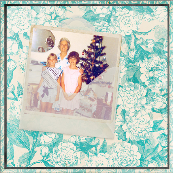
7- Finally, try to match all the colors in the layout.
I’ll admit, this is probably the hardest thing to do when working with patterned papers and embellishments. But don’t worry, it rarely happens without a little tweaking! This is where you will love your software for how it helps you pull everything together.
Look at your page and determine if one or more colors just seem a little “off.” In my page, everything was working well except the white in the patterned papers – it was too bright and too stark to be paired with an older photo. By blending another paper from the kit over my background, I reduced the glare, created some age, and took the focus off the background.
I can’t wait to see how you play around with the pattern patterns in this month’s Scrap Girls Club! Be sure to post your layouts in the Scrap Girls Gallery so we can “leave some love” on your creations.

Article written by Jody West