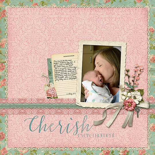
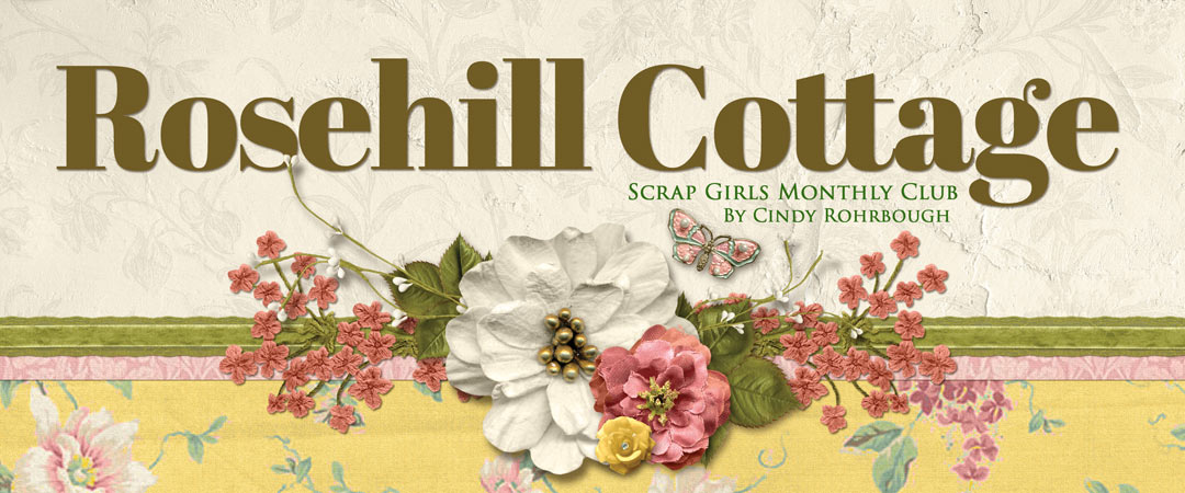
This month’s Scrap Girls Club: Rosehill Cottage by Cindy Rohrbough, is full of pretty vintage papers and embellishments. I was delighted to find that a beautiful set of Ephemera Embellishments was included. Many of them work perfectly for adding journaling to your scrapbook pages.
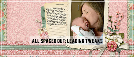
I love writing my journaling on lined papers, but most of the time, the text doesn’t line up with the lines. This tutorial will show how to adjust the space between the lines of your text. This is called the leading (and it’s pronounced like the metal lead, not like the verb lead). Adjusting the leading will make your journaling fit within the lines on the paper. I’ll show you how quickly you can do it.
Step 1: Choose a handwriting font and open a text box in the layer above the paper you’ve chosen.
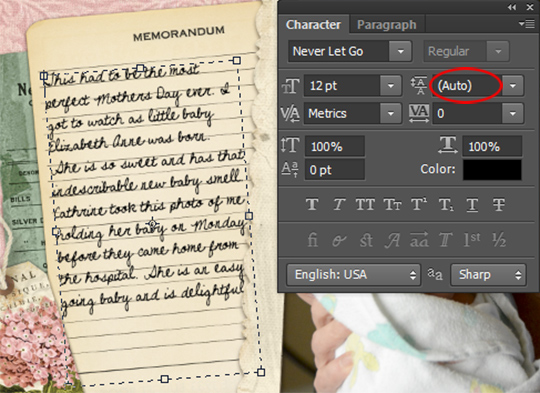
Type your journaling in the text box. Be sure to choose a font size that’s large enough to read when your layout is printed. Handwriting fonts are harder to read at small point sizes, so size wisely. My page uses a 12-point font. You can see in the screenshot below that the lines are much farther apart than those on the paper. The writing and the lines don’t match, and tweaking the leading will make the journaling block perfect.
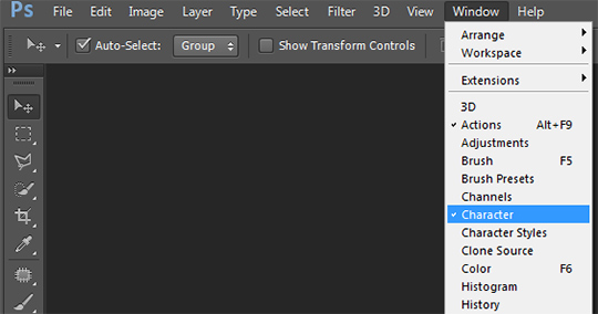
Step 2: Open the Character panel.
To fix the misalignment of the journaling, I head over to the Character panel. Look at the top bar in Photoshop and choose the Window drop-down menu. Next, select Character.
Step 3: Select the characters you want to change.
Highlight the text in the journaling block. This tells Photoshop that you want to change something in this text. If you don’t select any text, the leading will apply to any new text you create.
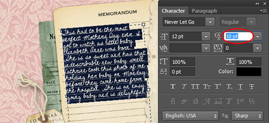
Step 4: In the Character panel, set the Leading value.
Mine was set to Auto, which is usually a good choice. For this journaling block, I changed the Leading to 10, and the words now fit within the lines just as perfectly as if I had handwritten it with a pen.
Adjusting the leading to fit the lines in a journaling block makes your journaling look more polished, plus when you use a handwriting font, it adds that handmade look to your digital pages. However, any time you have a journaling block with lines, no matter what font you use, adjusting the leading to make your text and journaling lines work together will always improve the look of your layout.
While this tutorial shows how to reduce the leading make the text fit within the lines, you can also increase leading for a dramatic look. Try playing with the leading on one of your next scrapbook pages and show us the results in the Scrap Girls Gallery. We’d love to see what you’re working on!
![]()
 An Amazing Deal!
If you were to buy all of the items in the club individually from the Boutique they would cost $27.64 and we offer it to you for just $9.99 a month!
MONTHLY SUBSCRIPTION![]()
![]()
 Tutorial written by April Martell