• Facebook
  • Twitter
  • Google
ScrapGirls
  • SHOP
  • LEARN HOW
  • BLOG
  • FORUM
  • CHAT
  • CONTACT US
Select Page
Home / All Posts / Leading: It’s all About Space

Leading: It’s all About Space

Leading: It's all about text line spacing - Intro banner

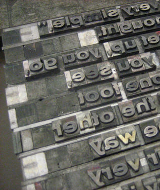
Leading. Right now, the voice in your head is probably pronouncing it as “leeding,” right? As in “leading a parade” or “leading with distinction.” But when we’re talking about graphic elements, leading is pronounced “leading.” Now that the voice in your head knows how to say it, let’s talk about what leading is and what it offers you in digital scrapbooking terms.

According to Wikipedia, leading refers to the “distance between the baselines of successive lines of type.” Or in simplest terms – the text line spacing or the space between lines of type. The term leading originated in the days of handset type – when strips of metal (lead) were inserted between rows of metal letters in the printing presses to increase the space and improve legibility.

Photo Credit: http://eliseblaha.typepad.com
Most of us are familiar with line spacing from typewriter use – single spacing and double spacing. We are also used to leading in Microsoft Word and equivalent programs where we can select single spacing, 1.5 spacing, double spacing, and more.

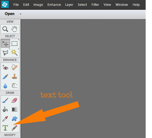
We also come across leading in our scrapbooking programs. In Photoshop Elements 12, it appears after you click the Text tool.

In the dialogue section that appears, there is the option to adjust the leading.

Often, it will say (Auto) in the leading box. This is based on a default formula of “font size + 20%” (e.g., a font of size 10 will have a default leading of size 12). This is a good default and works in many cases, making it easy for the eye to track between lines and preserving legibility.

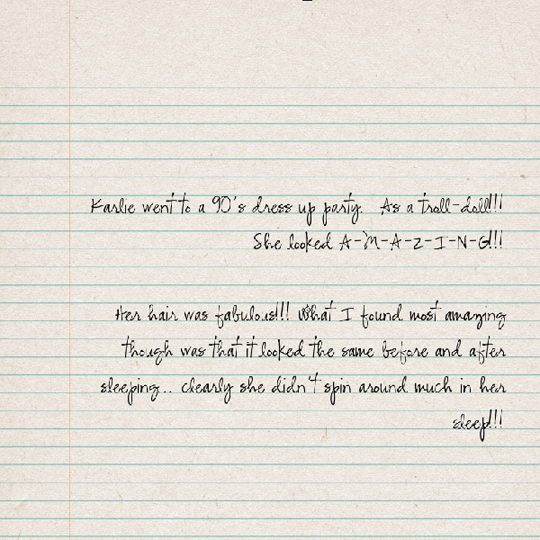
However, it doesn’t always work. For example, cursive and decorative fonts often require a larger leading to allow for the “busy-ness” of their designs. Serif fonts may also need adjustments in leading, as well as text with lots of ascenders and descenders.

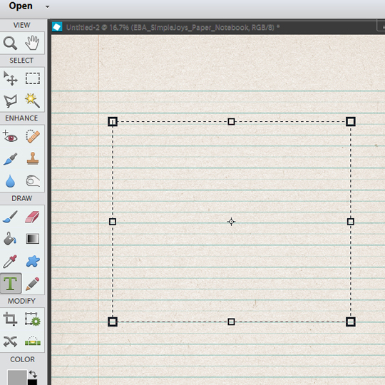
Furthermore, as scrapbookers, we sometimes need to adjust our leading to fit a design item. An example of this is lined paper. Sometimes the spacing of our text results in it falling directly on the line or floating aimlessly. To improve legibility and overall aesthetics, the text needs to be on the line. This is incredibly easy to do and gives a much more polished feel to the page. Let me show you how:

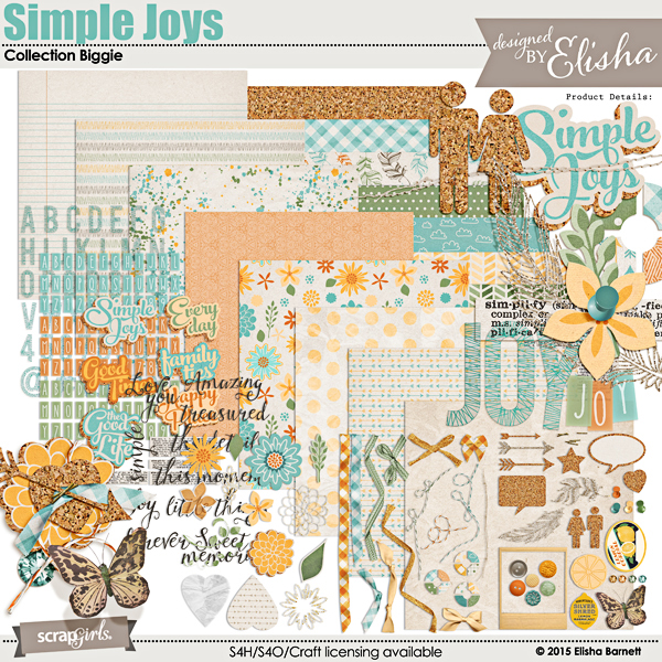
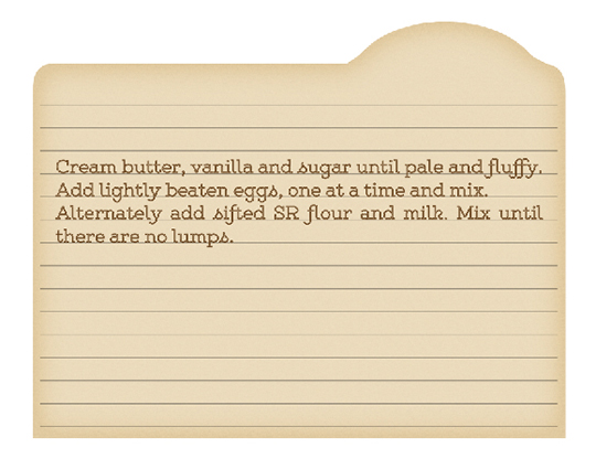
1. Place your design item. In this case, I have chosen the Notebook paper from the Simple Joys Collection Biggie by Elisha Barnett.

2. Choose your font. I like to try a few fonts to find one that suits the subject of my journaling and the style of my page. Once you’ve settled on a font and size, you can start making adjustments.

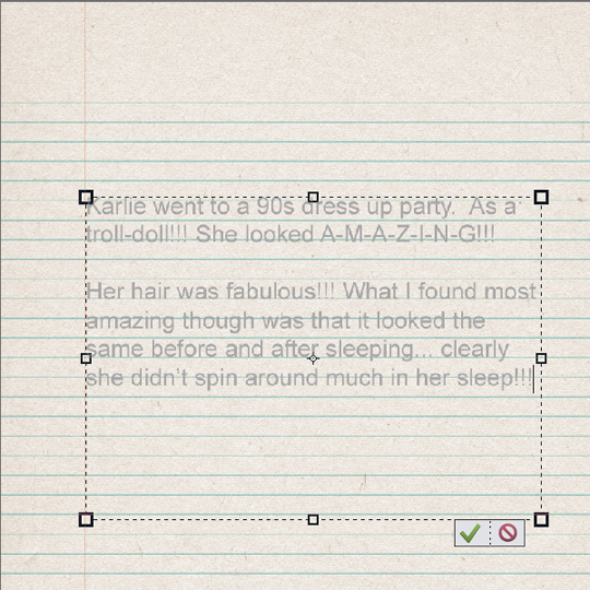
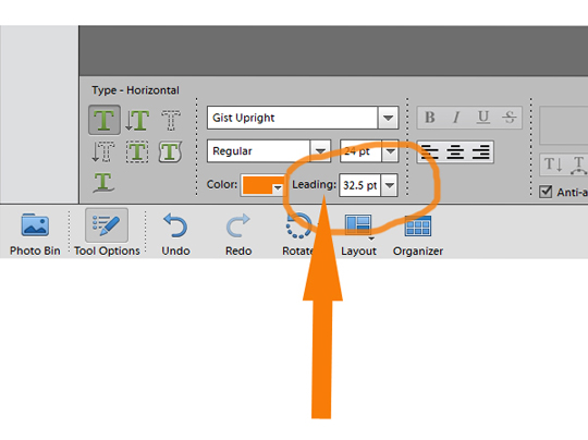
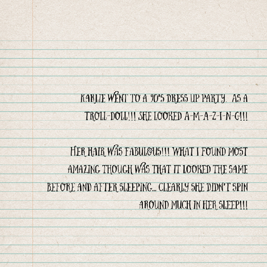
3. Select a size for your text that fits the lines in your paper. In my case, this was a size 28. My font is Butcher and Block. Using trial and error, I settled on a leading of 49.5.

As a matter of interest, this was the same setting that worked for the font CK Ali’s Hand also.

The same method works for non-notebook style papers. On this page, I tilted my text to suit a diagonally-striped paper from Perfection Collection Mini by Angie Briggs. This example uses the font LDJ Mother’s Typewriter in size 17 with a leading of 24.

Another example of the importance of tweaking leading is when making a recipe card. This time I used Ginny Whitcomb’s Grandma’s Kitchen Embellishment Biggie and chose a blank recipe card. Selecting Gist Upright as my font, and after some trial and error, I settled on a size of 24 with leading of 32.5.

Clearly, don’t limit yourself to the default setting for leading. On a blank page, it looks great, but sometimes you need to tweak things to get them looking their best. You spend time adjusting shadows, recoloring items, and carefully choosing a font, so by checking your leading, you give your page that final, perfectly-polished feel.

There are no magic numbers for perfect text line spacing; it’s all personal preference, so have-a-go and play with the leading setting! Then load your “leading-adjusted” pages to the Scrap Girls Gallery for us to admire and be inspired by your creativity!

Simple Joys digital scrapbooking kit
Simple Joys Collection
Grandma's Kitchen Embellishment Biggie - Recipe Cards
Grandma’s Kitchen Embellishment Biggie – Recipe Cards
jody west
Tutorial written by Jody West

Welcome to the SG Design Shop Blog - where modern memory keeping meets heritage scrapbooking! Here you'll find digital products and all the inspiration you need to complete your projects.

subscribe-imgTo our Free Newsletter

Search the blog

Favorite Categories


Learn How Sidebar Badge
Tutorials Sidebar Badge
hybrid projects sidebar button
art journaling sidebar button
mobile scrapping sidebar button
planners sidebar button

Connect with us

SG Facebook Image

Partners

Qwiklearn -The easiest way to learn digital scrapbooking!

Adobe Photoshop Affiliate Badge

Links

  • About Us
  • Storefront
  • Terms of Use
  • FAQs

HELP

  • Contact Us
  • Email

FOLLOW US


© 2023 Scrap Girls - All Rights Reserved.Privacy PolicySite Map