• Facebook
  • Twitter
  • Google
ScrapGirls
  • SHOP
  • LEARN HOW
  • BLOG
  • FORUM
  • CHAT
  • CONTACT US
Select Page
Home / All Posts / Layout Design Process: Amy Flanagan

Layout Design Process: Amy Flanagan

design process layout amy
We are excited to bring you a new series where we interview Product Designers and Creative Team members about their layout design process. We hope this will give you insight into the inner workings of their creative process and inspire you along the way!

This time we are interviewing Creative Team member Amy Flanagan!

AmyF_ArtistPhoto_Blog_400

Where do you find inspiration for your layouts?

I find inspiration in many places. Pinterest has become a favorite – not just for layouts, but for textures, themes, embellishment ideas, mood boards, and color palettes. And quotes! I could easily get lost in the quotes and Scripture pins, and they often spark a layout idea.

What is the first thing you do when beginning a layout

The first thing I do is make a fresh pot of coffee! Then, after creating the new workspace, I save it with a unique name so I don’t overwrite my original file.

Would you say that you have a “system” or do your layouts seem to fall into place as you go?

For the most part, my layouts fall into place as I go. To take it a step further, I would say that 90% of the time when I start a new layout, I have absolutely no idea what it will look like in the end.

Is there a product or tool/technique that you use on most layouts?

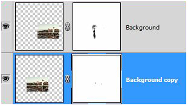
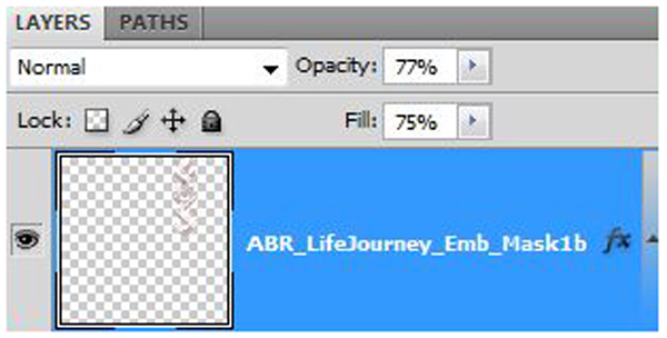
Almost 100% of my layouts use Sarah Batdorf’s ScrapSimple Tools – Actions: Deep Shadows 6501 PSE and PS Biggie. I love the realism they provide, and the action does all the work for you. If I’m making an Art Journal page, then the shadows usually stay off.

What is the one piece of advice you can give our readers?

My advice: Don’t be afraid to experiment. If you open the original file, then “Save As” with a new file name, you have made a copy of your original. Close the original. Work off the copy. You can do anything under the sun, explore the power of your software and push your creativity beyond what you thought possible. If you don’t like the result, just close it out – since you’re working on a copy, it won’t hurt the original at all. You’d be surprised how often you might find a “Happy Accident” that takes your layout from fabulous to stupendous!

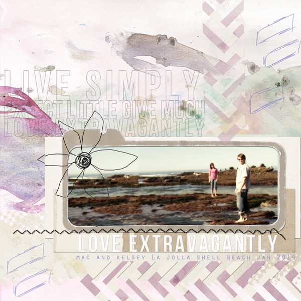
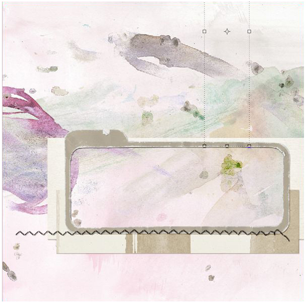
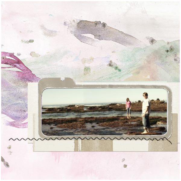
Amy’s layout step by step:

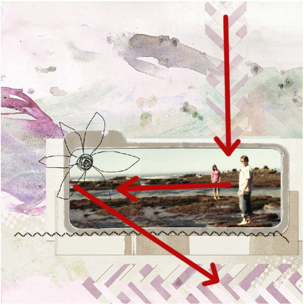
The following photo is my favorite picture of my nephew and his girlfriend from their visit here last January. I loved the long linear aspect of the photo and their positions relative to one another. After running a RadLab treatment on the photo, this photo had to take center stage! I decided to make this layout with a clean, neat format with a lot of white space.

layout design amy photo
First, I found the background paper. I chose this paper due to the watercolor effects, the light, wispy, almost beachy feel to it, and the color complemented Kelsey’s shirt. Then, I found the frame element from Value Pack: Life’s Journey Collection. It complemented the linear aspect of the photo.

layout design amy paper
However, when the photo was placed under the frame, it didn’t quite fit the way I expected. Using a duplicate copy of the photo and a layer mask on each, I offset the duplicate copies of the photo and blended the edges together so now two copies look like one photo. Since we were at a tide pool, the uneven surface of the rocks and the water blended imperfectly but nicely.

layout process amy layer masks
layout process mask results
Next, I added some elements. The chevrons were placed strategically to draw the eye to Mac and Kelsey. The Blending modes were left at normal, but to soften the look, the vertical chevron had the opacity and fill both lowered to a pleasing level.

layout design amy opacity
I was also considering the visual triangle between the vertical chevron, to Mac and Kelsey, across the photo to the flower, then down to the word art.

layout design amy visual triangle
Next, I wanted a bold title that didn’t take over the page. I started with a white title, but it was too heavy.

layout design amy heavy title
To maintain the title but reduce the weight, I made a stroke around the word art on its own layer, then deleted the word art. To do that, I highlighted the word art layer and hit Ctrl+Click to get the “marching ants.” Then I created a new layer above the word art layer. Then, I went to “Edit> Stroke” and selected the stroke width to be 4 in the color black. Since the stroke has been placed on its own layer, the original word art was turned off, leaving an outline of the word art.

edit stroke layout design amy
amy word art
To soften the look further, the outline layer had the Blending mode set to Luminosity, and the fill and opacity were both reduced. This maintained the size of the word art but allowed for a softer presentation to go with my theme.

layout process amy stroke
Part of the original title was duplicated below the photo without an outline to give emphasis to that portion of the title work, which then allows the eye to travel to the journaling details directly below that.

layout design word art 2
Finally, some light brush work was done just for fun to bring a little more depth to the layout.

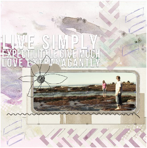
The layout is now complete. I hope you enjoyed some of my thought processes as my layout was designed!

– Amy

Digital scrapbooking products used:

Value Pack: Life's JourneyYours Truly Collection Biggie

might like
Amy’s layout has art journal elements with a mix of traditional embellishments, check out a few other art journal products below!  (Click on the images to be taken to their product page)

Altered Art Essentials 1 Paper MiniBasic: Collage 2 Paper Mini

Artsy Spirit Collection BiggieScrapSimple Tools - Styles: Heart and Soul

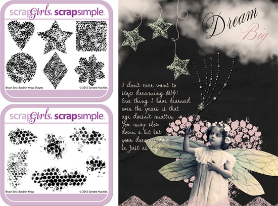
Brushes are great for creating art journal style layouts and will add a realistic painted look to any project! They are not only fabulous for adding a finishing touch, but you can create a unique background by brushing all over your page!

bubble wrap brushes

Short on time? Then our line of Digital Layout Templates are for you! The best thing about templates is the ability to mix, match, and move  the pieces around, giving you an endless supply of layout options!

(Click on the images to be taken to their product page)

ScrapSimple Digital Layout Templates: Artsy TextScrapSimple Digital Layout Templates: Artsy Text

ScrapSimple Digital Layout Album Templates: On A Tilt MiniScrapSimple Digital Layout Album Templates: On A Tilt Mini

ScrapSimple Digital Layout Templates: Blended GrungeScrapSimple Digital Layout Templates: Blended GrungeScrapSimple Digital Layout Album Templates: Album Series 12 MiniScrapSimple Digital Layout Album Templates: Album Series 12 Mini

art journal

Welcome to the SG Design Shop Blog - where modern memory keeping meets heritage scrapbooking! Here you'll find digital products and all the inspiration you need to complete your projects.

subscribe-imgTo our Free Newsletter

Search the blog

Favorite Categories


Learn How Sidebar Badge
Tutorials Sidebar Badge
hybrid projects sidebar button
art journaling sidebar button
mobile scrapping sidebar button
planners sidebar button

Connect with us

SG Facebook Image

Partners

Qwiklearn -The easiest way to learn digital scrapbooking!

Adobe Photoshop Affiliate Badge

Links

  • About Us
  • Storefront
  • Terms of Use
  • FAQs

HELP

  • Contact Us
  • Email

FOLLOW US


© 2023 Scrap Girls - All Rights Reserved.Privacy PolicySite Map