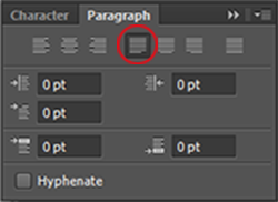
I love using justified text for journaling on my layouts, because it has a clean, streamlined look. Justified text is spaced so the left and right sides of the text block both have a straight edge. You can choose several options of justified text in the Paragraph panel of Photoshop, but I almost always choose
Justify last left. If your Paragraph panel isn’t showing, select Window > Character to make it visible.
Justification works by adjusting the spaces between the words in each line to make all the lines the same length. When your paragraphs are wide, the extra spacing isn’t usually noticeable, but when you justify a narrow paragraph, the extra spacing can leave huge gaps in your text. In this tutorial, we’ll go over a few ways you can fix this.
- Hyphens are the easiest way to minimize the problem, though I prefer not to use them in my journaling blocks.
- Adjusting the font size and tracking can improve the word spacing.
- Add extra adjectives to your journaling in just the right places.
If the above methods don’t work for you, I have good news! You can adjust the justification settings to help solve the problem.
First, select your text, and then choose Justification from the Paragraph panel menu.
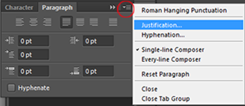
This will open the Justification panel which allows you more control over how Photoshop spaces letters and words, and how it scales characters. The screenshot below shows the default settings. Notice the uneven spaces between some of the words in the paragraph.
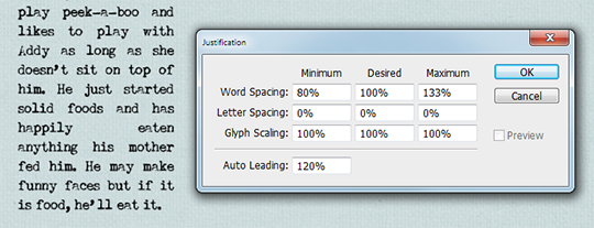
- Word Spacing is the space between each word.
- Letter Spacing is the distance between letters.
- Glyph Scaling controls the width of the characters.
- Leading controls the spaces between each line.
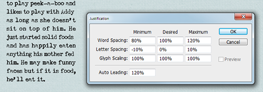
While adjusting the spaces between words rather than the letters is preferred in the typography world, I got the results I wanted by slightly adjusting the letter spacing. The settings you choose will vary depending on the font you use, and the size of your font and text box. If you opt to change the letter spacing, keep the difference between the minimum and maximum percentages as small as possible, or the differences in letter spacing from line to line may look worse than the large gaps you’re trying to fix! Play with the numbers until you are satisfied with the results.
The screenshot below shows how the adjustments I made helped make the word spacing look more natural.
Justified text can give your journaling a more streamlined look and is perfect for using with journal papers, pocket life pages, and templates with a rectangular block of text. We’d love to see your pages showing the ways you use justified text in the
Scrap Girls Gallery!

 Article written by April MartellTutorial written using Photoshop CS6 with Windows 7