
When you’re planning a digital scrapbook wedding page, you want something memorable, something polished… maybe even elegant. But sometimes that’s a challenge when you’re dealing with competing color palettes. Do the tones in your photos coordinate with the tones of the background paper and elements you want to use? Converting photos to sepia is a great solution to even out the color palette while adding elegance at the same time.
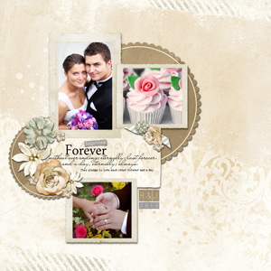
In this digital scrapbook layout, the bright colors are just too much for the neutral paper and elements, and the images actually interfere with the elegant, contemporary look I want to achieve. That’s when I turn to one of my favorite techniques — converting the photos to sepia. I call it “The Great Equalizer”. Sepia levels the playing field and brings a harmonious balance to a multi-photo layout.
Now I don’t like just any sepia. Most photo editing programs contain automated tools for creating sepia conversions, but those built-in options are just too brown or too orangey for me — and very flat-looking. I like a rich, deep, dark sepia… just a few shades shy of black-and-white, with a nice boost of contrast.
Take a look at these two examples and you’ll see what I mean. The one on the left is the “ordinary” sepia that you can achieve by just manipulating the Hue and Saturation in Photoshop or Photoshop Elements, or using the “Old Fashioned Photo” option in Photoshop Elements 11.
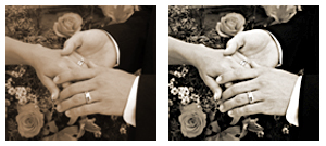
The one on the right looks much more dynamic with great contrast and detail. So here’s how to achieve that rich, coffee-toned sepia I love.
There are a couple of ways to do this, but this way is quick and easy in either Photoshop or Photoshop Elements.
First, open the image you want to convert. Duplicate the original image by pressing Ctrl+J in Windows (Mac: Cmd+J). You’ll be working on the copy, which will leave the original image intact.
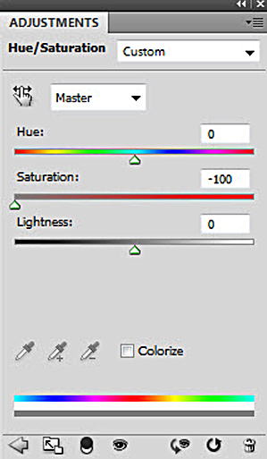
In the Layers Panel, click on the Adjustment Layer icon (the round icon that’s half black and half white) and choose Hue/Saturation. Move the Saturation slider all the way to the left to make your image black and white.
Next, go to the Blending Mode menu and select “Overlay.” You’ll notice that your image has some color again, along with a nice jolt of contrast. With the Adjustment Layer still selected, press Ctrl+E (Mac: Cmd+E) to merge the layer with the one just below it.
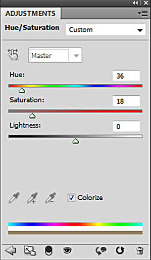
With the top layer still selected, go back to the Adjustment Layer icon and choose Hue/Saturation again. First, click the box next to Colorize, then set your Hue slider almost all the way to the left. As I said, I like a nice, coffee-toned sepia, so I’ve set my Hue slider to 36, and my Saturation slider to 18. You won’t need to mess with the Lightness slider at all.
In the Layers Panel, with that sepia Adjustment Layer selected, press Ctrl+E (Mac: Cmd+E) to merge the layer down.
That’s all there is to it! Save your converted sepia photo with a new name (to preserve your color original), and it’s ready to go on your page. You may want to play with the Hue and Saturation settings a little to achieve a different tone of sepia if you like. Make a note of your settings, though, so that you can use the same ones for any additional photos you’ll be using on your page.

See how much more polished and pulled together this digital scrapbook page looks with the sepia images instead of the color ones? Gotta love The Great Equalizer! Give it a whirl, and try converting your photos to sepia and let’s see your results in the Scrap Girls Gallery.
![]()
Digital scrapbooking supplies used:

![]()

Tutorial written by Jan Walker