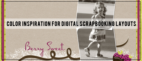
There are many ways to color ScrapSimple products, but how do you decide which colors to use on your digital scrapbooking page? Color inspiration for your scrapbooking pages can sometimes be a hurdle to getting started.
The usual color inspiration for any of our scrapbook pages is our photo. However, if you are scrapping a black-and-white photo, I have another suggestion for choosing colors: magazine ads.
Ads are designed to be eye-catching, and that’s where the “plus” comes in. Not only do they provide color inspiration, but they give you design inspiration as well. Here’s an ad that caught my eye. Its colors and crisp, modern design inspired a recent layout.
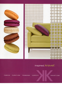
Tip: In order to have the ad handy for both color and design use, I scanned it and positioned it as the top layer of my layout. When I wanted to look at it or match one of its colors, I clicked the eye icon in the Layers Panel to make the ad layer visible; otherwise, I clicked on the eye icon again to turn the layer off.
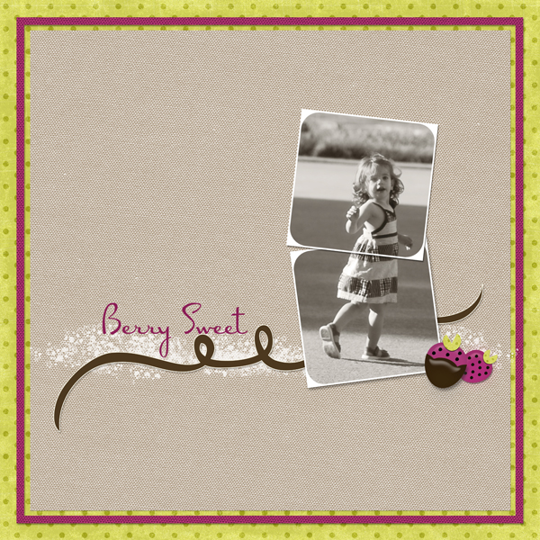
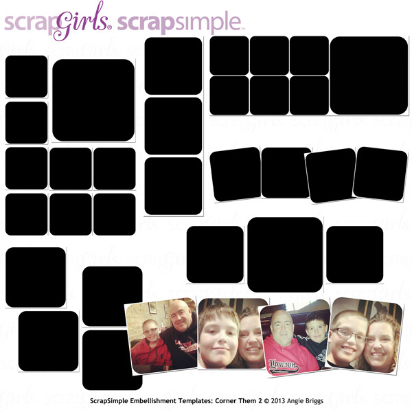
Now to design: What I like about the SG Design Shop is you can always find what you need. I found off-kilter frames in Scrap Simple Embellishment Templates: Corner Them 2 that reminded me of the tumbling French macaroons in the ad. I merged two frames and added my photo. I placed the merged, framed photo towards the right of the page, inspired by the placement of the sofa, which is the focus of the ad. In keeping with the simple design of my ad inspiration, I chose a plain-textured paper template to be my background.
Now the color fun began. I looked again at the magazine ad and realized that what made the bright colors work were the neutrals. I decided to color my ScrapSimple paper template with the neutral tan from the ad and to save the stronger colors for accents.
Using the Color Picker Tool (keyboard shortcut: I), I touched the tan color in the ad, making it my foreground color. I selected the ScrapSimple background paper in the Layers Panel to activate it. I went to Enhance> Adjust Color> Adjust Hue/Saturation and clicked on “Colorize.” The paper still needed some color adjustment, so I moved the Saturation and Lightness sliders until the paper became the right shade. I also duplicated the paper, this time colorizing it with the magenta from the ad and cropped it into the small frame for the page.
Shopping again in the SG Design Shop, I found a pretty green paper in the Be Natural Collection and edged my layout with it. I added a few simple magenta, brown, and white embellishments to finish the page.
That’s how it goes with magazine inspiration. The ad provides color-plus-design ideas, but the finished digital scrapbook layout becomes your own creation. I challenge you to use this or any other ad to make your own layout, then upload it to the Scrap Girls Gallery to show us what you created!
Digital scrapbooking supplies used:
ScrapSimple Embellishment Templates: Corner Them 2
![]()

Tutorial written by Diane Lardieri