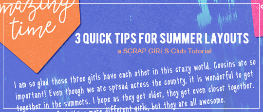
With all that to love, I have to admit that this style of scrapping is slightly outside my comfort zone. But I decided to jump right in and see what happened! Score! If you see elements like these and think, “I love it, but I don’t know how to use it,” then this article is for you! Here are some hints I can share with you from what I learned:
1. Faux-blending pictures into the background
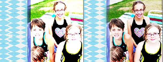
The papers in this club have lots of color, but a number of them also have big patches of white. These spots are the perfect places to experiment with blending pictures into the background. I started by cropping and resizing my picture to cover the white portion. Add a mask to the photo and cover any portions that cover parts of the paper that you want visible. This masking step doesn’t need to be too exact – it looks cool if the edges are a little irregular.
Personally, one of my complaints about blending photos into a background is that you tend to lose detail. To get around this, make a copy of the photo layer and apply the Blending style to the copy layer. Then adjust the opacity of that layer – enough to get the blended look without losing the detail. The picture on the left is set on “Linear Light” Blending mode. The picture on the left has an unblended picture layer underneath with the blended layer set at 30% opacity.
2. Journaling cards with patterns
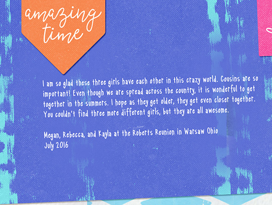
I love all of the journaling cards in this club. They would be awesome for Project Life-style layouts. But for those of us not doing Project Life, they are still super useful. I love using them to anchor my journaling to my page because it helps to set it apart and make it stand out. Most of the journaling cards have a lot of pattern or distressing on them, which can make the writing difficult to read. But not to worry — a little brush work can make all the difference! Place your journaling card on your layout, then type your journaling. Next, make a new layer and place it between the journaling card layer and the text layer. Use the Eyedropper tool to select the main color from the journaling card. Using a soft-edged brush, apply the color behind the text anywhere it’s difficult to read. You can reduce the opacity to make it even more subtle.
3. Don’t hesitate to make changes!
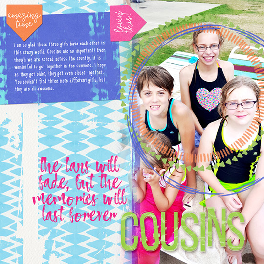
Resize and recolor things! The Big Quotes word art in this club are so cool, and they have so many fun possibilities for your layouts. I resized one of the Big Quotes and colored it hot pink. I also re-colored the alpha to bring more green to the page. The beauty of digital scrapbooking is that things can always be adjusted or tweaked to make them work perfectly.

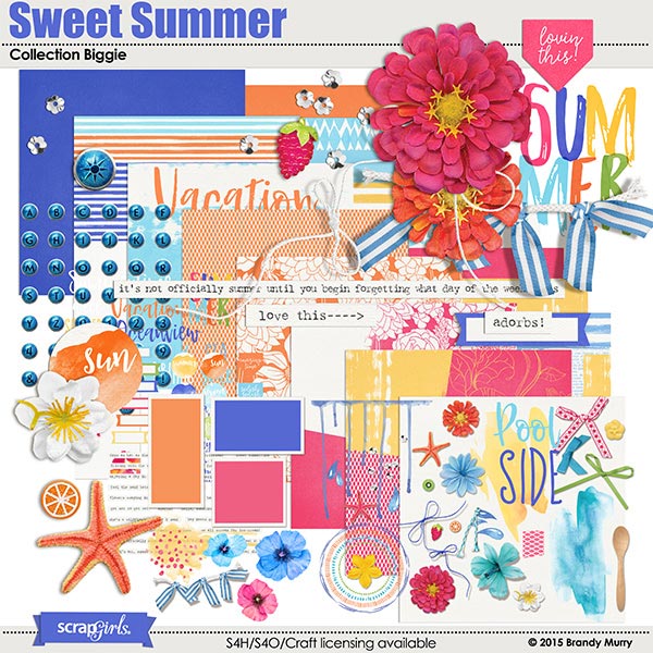
Sweet Summer, along with 7 other beautiful coordinating products were originally offered as a Scrap Girls Club selection. If you were a club member you would have received all these supplies for just $9.99 a month!
Join the Club today and start saving tons of money on our top designs!
Learn More