
There’s an old saying among writers, “Write what you know.” This is great advice, especially in times of writer’s block. But what about digital scrapbookers? What do you do when inspiration escapes you, and you’re faced with a case of scrapper’s block? I say, “Scrap what you love.” On those days when you want to create, but you just can’t muster up an idea, scrap what makes you happy.

Devote a page to something that delights you, regardless of how silly or simple it may be. You just might find that those quick, spontaneous, digital scrapbook layouts are the ones that bring you the most joy. Kittens make me happy… can you tell?
One way to get that instant gratification is to fill the page with a large photo, and add a few simple embellishments… an interesting alpha, or a cute frame… maybe some word art, with a poem, verse, or favorite quote.
When creating full-page photo layouts, one thing that makes me happy is using textures, overlays, and Blending Modes to enhance and add interest to my photos. Maybe you have a collection of textures in your digital scrapbooking files, but wait… did you know that in virtually every digital kit, there’s probably at least one background paper, sometimes more, that can double as a texture or overlay? What a bonus!
I love repurposing interesting papers that way. Most times, you’ll want to look for a fairly plain or solid-color textured paper, but sometimes printed papers can add a really special touch.
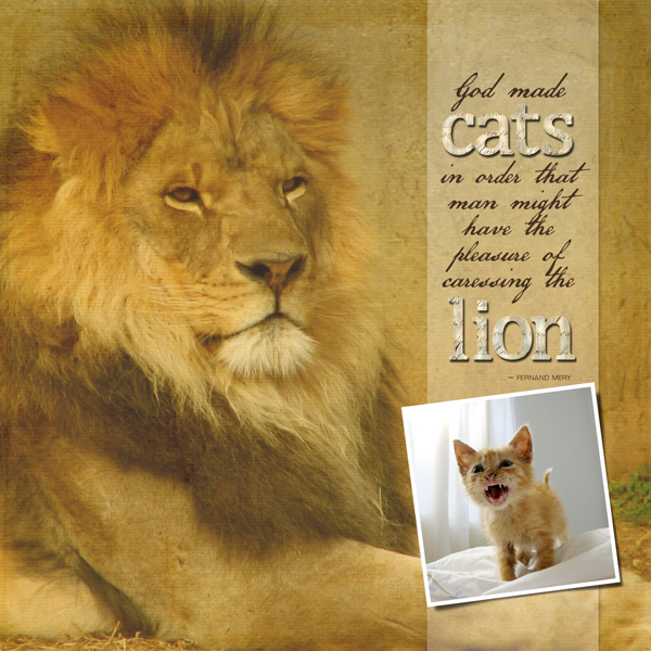
Take a look at this digital layout. I’ve enlarged the photo to fill the page, and it looks okay… but I want to really give it a nice boost.

So I’ve chosen a background paper (ABR_BWY_Paper_Yellow_Solid) from one of my favorite kits, the Being With You Collection Biggie by Angie Briggs. It’s going to bring some warmth and light, along with a bit of subtle texture to the photo.
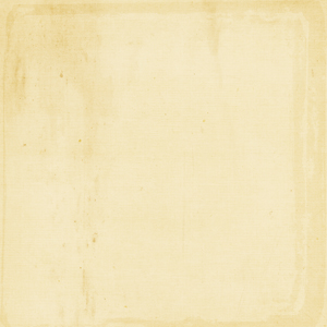
Look what happens when I add the paper as the top layer with a Blending Mode of “Soft Light” at 100% Opacity! Nice…

Now I could leave it just like that, but I think I’ll try a printed paper (ABR_BWY_Paper_Yellow_Damask) from the same kit, and see how that looks.
For this paper layer, I’ve chosen the “Multiply” Blending Mode at 100% Opacity. Your settings may vary, depending upon the photo and the paper you’re working with. If the texture layer interferes with any part of your image, just use the Eraser Tool with a soft brush to remove it from the areas of the photo you want to clean up.
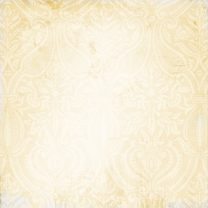
What I’ve achieved here is a very subtle print texture, which shows up nicely on the light curtain and around the edges of my page, and it enhances the golden tone of the entire page.

So there you have it! The next time you’re in the mood to create a digital layout, and you need a little inspiration, look around for something that brings a smile to your face… and scrap happy!

Tutorial written by Jan Walker