
![]()
***UPDATE: Color Palette #3 is the WINNER and the Scrap Girls Designers have been busy creating beautiful products coordinating with it – watch for sneak peeks on our Facebook Page!
Twice a year at Scrap Girls, our fabulous designers collaborate to create a unique collection that we call our “Charity Kit.” 100% of the sales from these collections go to help others.
Our charity of choice is Food for the Poor (http://foodforthepoor.org/). We have requested that money raised by Scrap Girls goes specifically toward providing clean drinking water, and Scrap Girls has helped Food for the Poor dig new wells in communities all around the world.
We asked you, our customers to join us in helping create our Spring Charity Kit and had so much fun that we would LOVE to have you help us out again!
Last week we asked your help in choosing the Theme – the choices were:
Lux, Rustic and Spice. Looks like SPICE is the winner!
Next up is choosing the color palette!
Here are your choices:
Color Palette 1 & Inspiration board
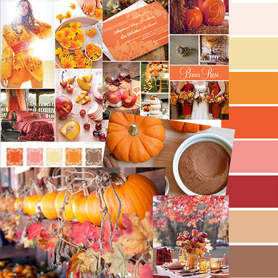
Photo credits:
Yellow & Peach
Briar Rose
Pumpkins & Leaves
Pumpkin Pie Spice
Table Setting
Color Palette 2 & Inspiration board
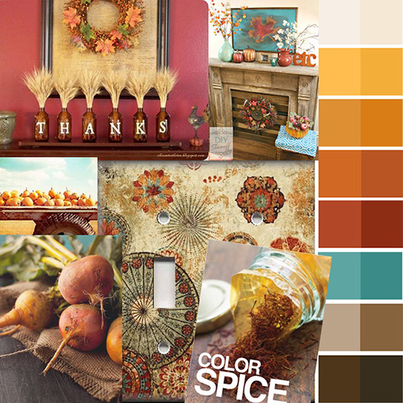
Photo credits:
Thanks
Mantle
Fruit
Color Spice
Medallion Switch Plate
Veggies & Burlap
Color Palette 3 & Inspiration board
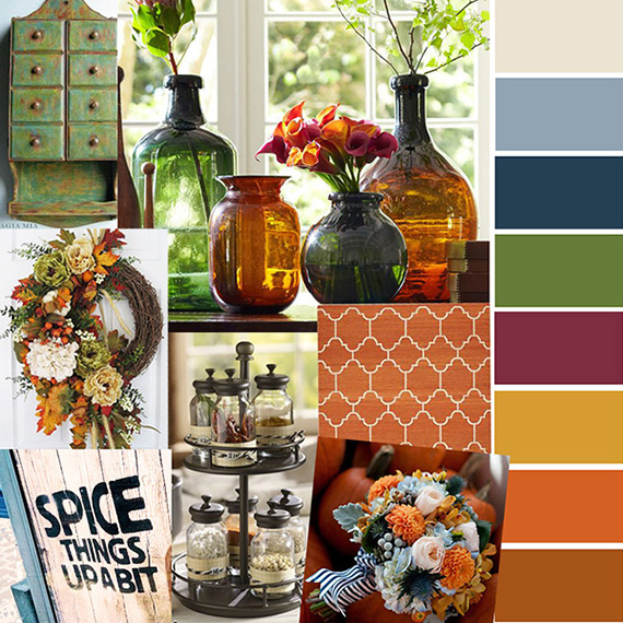
Photo credits:
Vintage Cabinet
Bottle Vases
Wreath
Fabric
Spice things up a bit
Spice Rack Pottery Barn
Fall Wedding Bouquet
Please visit our Facebook page (https://www.facebook.com/#!/ScrapGirls?fref=ts) and leave a comment letting us know which color palette is your favorite!
Then make sure to keep an eye out because we will also be asking your help in choosing a name; and as the designers create we will post sneak peeks on Facebook!
If you’ve ever wanted to have a say in what goes into a digital kit, this is your chance! And since 100% of the sales of the fall collection will go to Food for the Poor – it’s your chance to be part of a good cause!


I like #2 and #3 the best. Truthfully, I’ll probably like whatever you create!
I like number two because it is warm and happy/
I like number 3.
#3 gets my vote. But I’m sure whatever the designers create will be lovely!
I like #3 the best.
#3 is the one I like the best.
I like #3. Nice, rich colors.
I like #2 the best. The colors are rich and warm.335
No 3, a great selection of colours for male and female layouts.
I really like # 1 and the soft Autumn Hues! 🙂
My first choice is #3. Second choice #2, and #1 is my final choice. Great Autumn colors.
I like # 1 the best, but like all of them.
I like no 3. There is a bit of variaty in the colors.